Logos and Branding
Logos
While our official name is the John S. and James L. Knight Foundation, logos refer to the foundation as “Knight Foundation.” (Please refer to the Editorial Style section for proper use of the foundation’s name in text.)
Design brand manual
Primary Knight Foundation logo
The primary version Knight Foundation logo is the horizontal lockup. Please refer to the spacing section below for proper usage of it and the alternate versions.

Web ready format:
Black
White
Vector downloads (Adobe Illustrator, InDesign, and print friendly format):
Black
White
Spacing
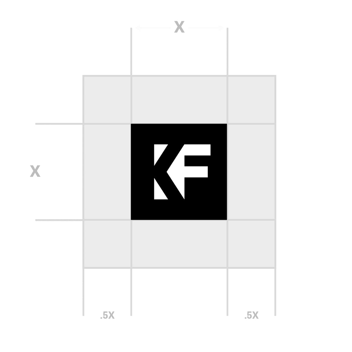
Be sure to provide adequate space around the logo to maintain its legibility and integrity. The amount of space is proportional to the size of the logo. The minimum amount of space around all sides of the logo is equal to the height of the mark.


Frequently Asked Questions
-
May I use just the “KF” by itself?
Yes. The square lockup is used primarily for social media and other applications where the horizontal version does not work. -
What logo can I use for the Knight Arts Challenge?
Please choose from the above Knight Foundation logos. -
Need more information?
Check the brand manual (PDF) to see if it answers your question, but contact us if you need help.
If you need a photo of one of our founders or an officer for publication, please visit our staff page. If you need additional help, send us an email, [email protected].
