Mobile notifications and ‘the final frontier’
Sasha Koren is editor of the Guardian Mobile Innovation Lab, a small, multidisciplinary team working within the Guardian US newsroom, exploring storytelling and delivering news on small screens for the benefit of journalism. It is supported by Knight Foundation.
Many of us who work in journalism, particularly those whose jobs have something to do with breaking news or mobile, willingly sign up for a ridiculous number of news alerts on our phones from a massive number of apps. But for all that obsessive notification watching, we tend to know little about how well “regular” readers—the consumers of the information we produce and customers of the services we offer—are served by the format. Or even IF they’re being served. Are readers getting the information they need or are they being overloaded? Does the alert format more often improve the way they consume news, or turn them off?
So I was happy to see the Engaging News Project take on some of these questions in their newly released study on users’ notifications habits. The more the news industry can learn about how people take to the formats we offer them, the better our chances of creating products they will stick with, and the better chances we have of staying relevant in their lives.
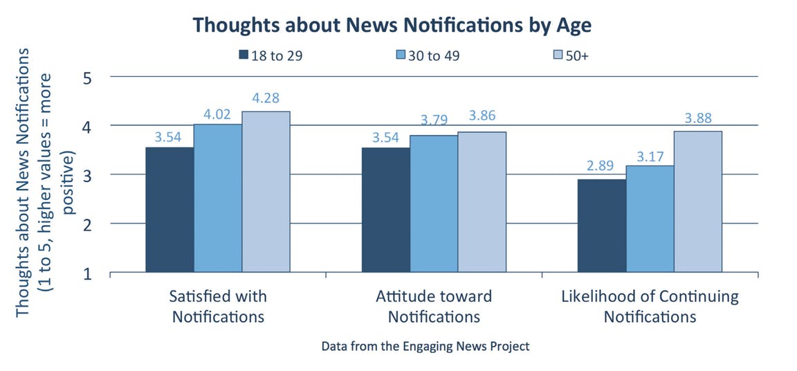
In reading the report on how readers feel about notifications from news organizations, a few of the key findings caught my eye right away. The first was: “Asked what they liked most about notifications, many mentioned relevant content and useful information.” And the second followed: “Asked what they liked least, people often mentioned the frequency of notifications and untailored content.”
I read these statements with excitement, even if they don’t tell a wholly positive story about the alerts people are receiving. Why? They confirm a few assumptions my colleagues and I have had while doing work on experimental notifications within Guardian Mobile Innovation Lab, where we have tested a variety of alternative notification formats that test the viability of features that might make them more relevant, useful and personal.
Since May, our team has been testing ways to tell some or all of a story within notifications. We’ve done this in an effort to see if new formats might resonate with users, based on an assumption that the standard, one-size-fits-all approach most news organizations have taken of sending breaking news and features updates in a general and non-personalized way was not the only way the space could be used. (There are a few notable exceptions: BuzzFeed News, USA Today and The New York Times offer in-app personalization options; Quartz sends delightful daily haiku.)
We’ve tested a variety of features that have offered live vote results (during Brexit); personalization (country-specific medal alerts during the Olympics); live coverage with fact checks and reactions (presidential debates); and a variety of interactive features like live polls and crowdsourcing. (Find out more about our work here.)
Some have worked better than others. For example, a poll sent in a notification the day after the Brexit vote to a mostly British audience, about the topic that most affected the way they had voted, saw high engagement, whereas polls sent before big Olympics events, asking users who they hoped would win, were not a big draw. Live data feed alerts accompanied by clever graphical alert icons sent during Brexit and the Olympics saw very high click-through rates to the Guardian’s live blogs, and received high marks in our follow-up surveys.
What we’ve discovered, and what the Engaging News Project study points out with statistical rigor, is the potential of the lock screen to function as a space for delivering information in a variety of ways to increase their relevance on individual news events. An obvious point, but one I’m compelled to make here, is that the phones are with us all the time, and we look at them—in lock screen mode first and as a gateway to further engagement with the apps and services underneath it. As my colleague and co-lead of the lab, Sarah Schmalbach, is fond of saying, the lock screen is the final frontier of focused attention. It holds to the potential to be used by news publishers as a storytelling platform in miniature, a place of vitality, personal relevance and even surprise.
The Guardian Mobile Innovation Lab has been working with the Guardian’s development teams to implement a version of our live results experiments in the Guardian iOS and Android apps on the night of the 2016 U.S. presidential election. Find out more here. Read about the lab’s experiments on Medium, or follow on Twitter.
-
Community Impact / Article
-
Community Impact / Article
-
Community Impact / Article
-
Journalism / Article
-
Journalism / Article
-
Information and Society / Report
Recent Content
-
Journalismarticle ·
-
Journalismarticle ·
-
Journalismarticle ·
