Uncomplicated structures and their variations at Rebekah Templeton
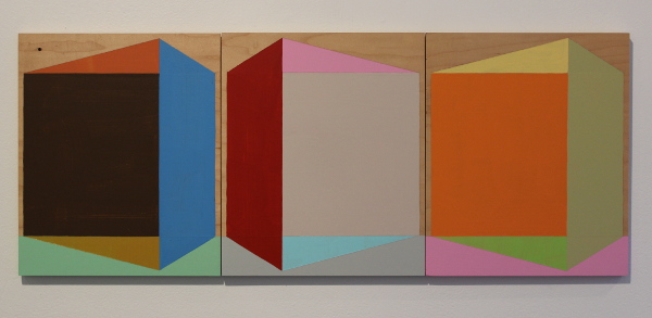
Returning from a brief hiatus, Rebekah Templeton Contemporary Art has once again opened its Girard Avenue gallery space, introducing a fresh splash of color throughout the bulk of February with artist Timothy Gierschick’s “The Ins and Outs.” This pastel-heavy exhibit utilizes a vocabulary of simple shapes and line work to assemble structures that are as intimate as they are alien.
Fashioned with geometrical swaths of house paint and sign enamel, these pieces often include two or more panels, effectively building imaginary interiors out of flat planes and pigment alone. These scenes are extremely concise in their execution, essentially using the minimum amount of material possible to convey the sense of location. One will not find furniture, houseplants, pets or appliances anywhere here, merely the indications of doorways, windows and walls.
Gierschick references the often symmetrical layout of square or rectangular rooms in a couple of ways here. Many of the shapes, from one panel to the next, appear to be mirror images of themselves. The colors don’t always follow the rules of reflection, however, and even when the shapes seem mirrored, their colors are not. Perhaps a sign of rudimentary lights and shadows, works like “Romper Rooms” reproduce and flip configurations over the course of a panoramic triptych, like the inconsistent play of lighting on the open doors and corners of an empty place.
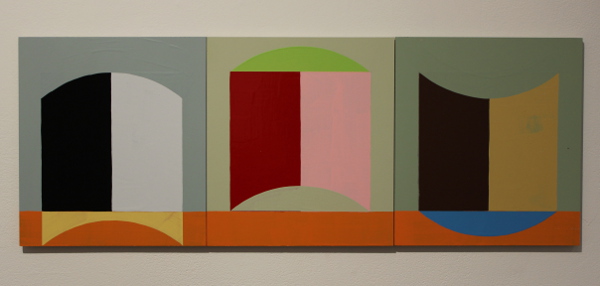
Timothy Gierschick, “A Poem by Bucky.”
In “A Poem by Bucky,” we find another horizontal spread of three panels, but here the images switch orientation vertically. The split shapes resemble closed doors, doorways, windows and rugs in turn, their curvatures mimicking forms we see on a daily basis without betraying their actuality. Despite bearing a title that might connect it to Buckminster Fuller’s famous geodesic architecture, there are hardly triangles to speak of, not only in this piece, but the entire show.
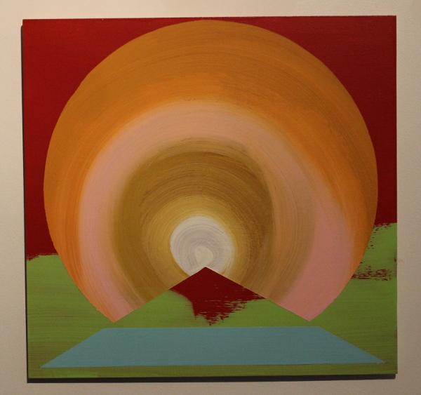
Timothy Gierschick, “Aurora.”
A pair of works consisting of only one panel each hang in the back office and seem to depict exteriors, unlike the rest of the show. Here we do find a triangle (possibly a pyramid) in front of what is most likely the disk of the sun, and a rounded arch above a similar, not entirely triangular object. These two diverge the most from the majority of the show’s layout.
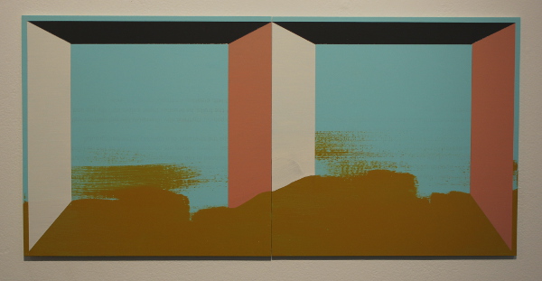
Timothy Gierschick, “Singing Sands.”
Variations on a theme are plentiful in Gierschick’s artwork, perhaps even the predominant design feature. The artist consistently applies paint in nearly the same way, producing only small, idiosyncratic differences in strokes or colors from one image to the next. One example is “Singing Sands,” in which the brownish heaps of dirt in the foreground blot out bits of the exterior structures, and two uneven brushstrokes imply an invisible wind kicking up the loose sand from the dunes.
Something about Timothy Gierschick’s creations is comforting and safe, like a familiar house or nostalgia for a favorite town. Their flat emptiness locates them more in the memory or imagination than in an actual place, however. Despite this disconnect, their soothing hues and modest design makes for an uncomplicated examination of all things drafted and built. The show will be on display through February 22.
Rebekah Templeton Contemporary Art is located at 173 Girard Ave., Philadelphia; [email protected]; rebekahtempleton.com
Recent Content
-
Artsarticle ·
-
Artsarticle ·
-
Artsarticle ·
